TWG Plus Brand Refresh
This presentation was created during the interview process at TWG Plus.
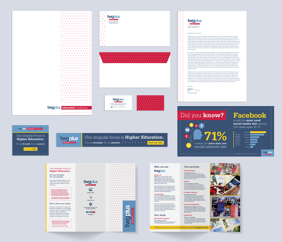
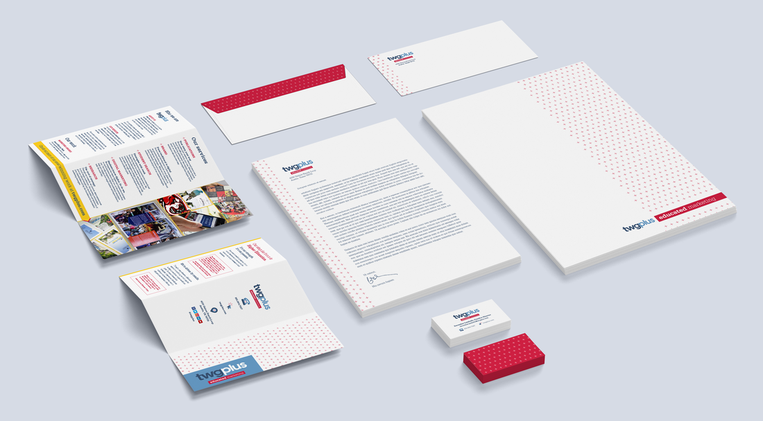
This project included a full stationery kit with a business card, letterhead, envelope, presentation folder and a tri-fold brochure.
I also created three digital pieces: two banner ads and one social media info-graphic.
This project included a full stationery kit with a business card, letterhead, envelope, presentation folder and a tri-fold brochure.
I also created three digital pieces: two banner ads and one social media info-graphic.
New elements introduced

Hello, yellowTo round out the existing set of colors, I chose a rich yellow for important information and calls to action, which makes the brand feel more scholastic.
|
Icon upgradeI created new icons to appear on marketing materials that form a consistent look with the same style, color and size.
|

Pattern & textureThe repeating plus pattern came to mind due to the name of the business, but then grew on me and took on a new meaning when I reflected on all the “pluses” that have come into my life due to my own experiences with higher education. I used this pattern to create bold visual interest on print materials when embossed. This pattern can easily be reversed and used in other ways as well.
|
Sketching ideas
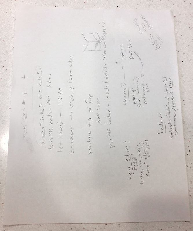
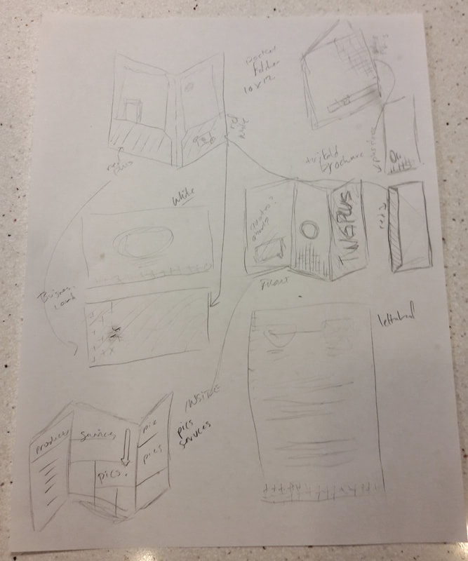
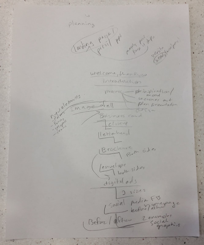
My creative process starts with the basics - paper and a pencil. I brainstorm by taking notes on project parameters and then start sketching out ideas - restructuring afterward. I have included thumbnails that show my thought gathering (1), product sketches (2) and an early outline of this very presentation (3). Structuring projects this way speeds up my workflow because I am able to see the big picture from the beginning.
How I applied these ideas & features to the existing brand
Stationary kit
This kit includes a business card, letterhead, standard envelope, presentation folder and a trifold brochure. All of the print materials would be on a bright white matte stock and include bleeds.
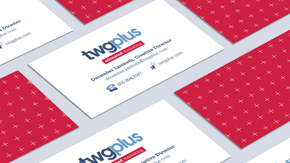
Business card
The business cards would feature a bold pattern on the back and customized contact information, alongside friendly new icons, on the front.
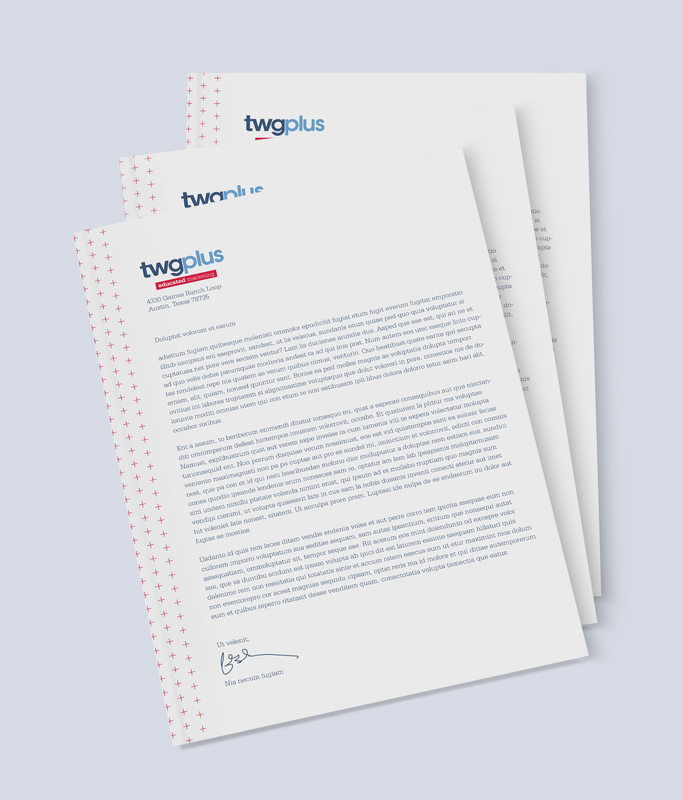
Letterhead
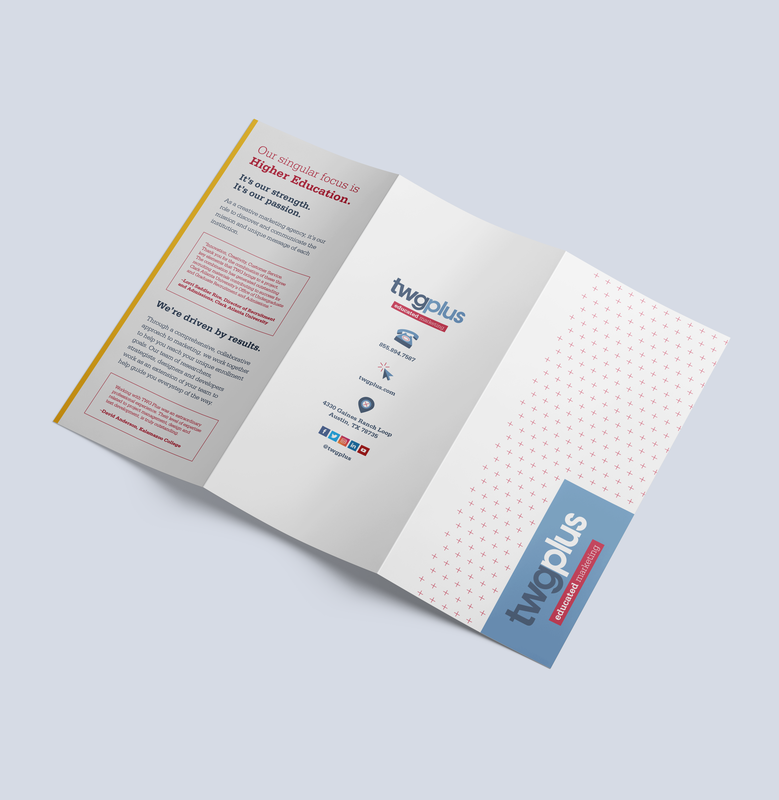
The letterhead features an embossed plus pattern and bleed down the left side, along with the three-color logo.
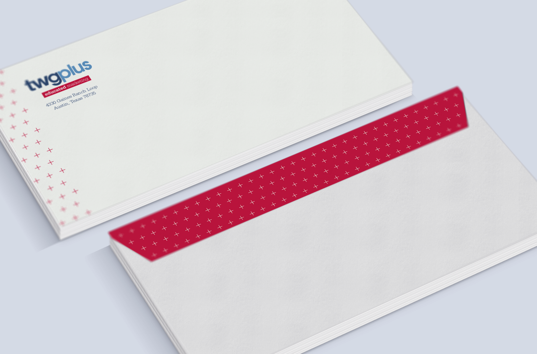
Envelope
The envelope would feature the embossed red pattern and the red flap on the back coordinates with the business cards.
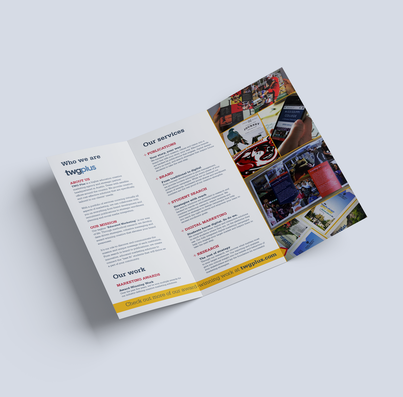
Trifold brochure
The brochure is the first product I designed using the new yellow swatch and it includes an overview of the company story and services, client testimonials, samples of work and a teaser to the website.
|
|
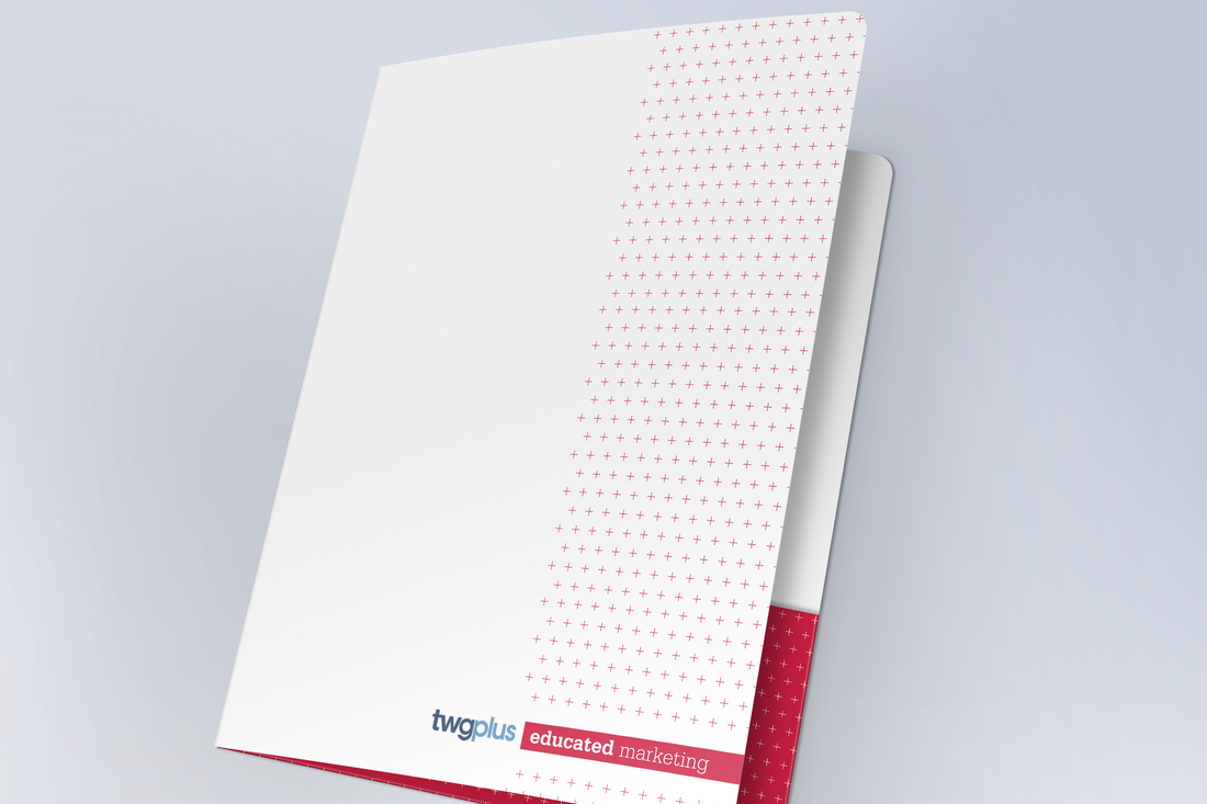
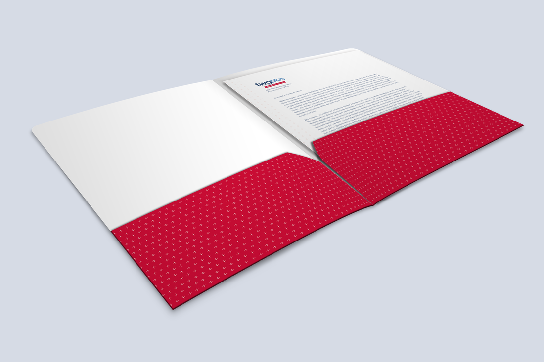
Presentation folder
The 10x12 presentation folder has rounded corners with the red pattern embossed on the front, similar to the other materials.
|
|
Social media & digital advertising
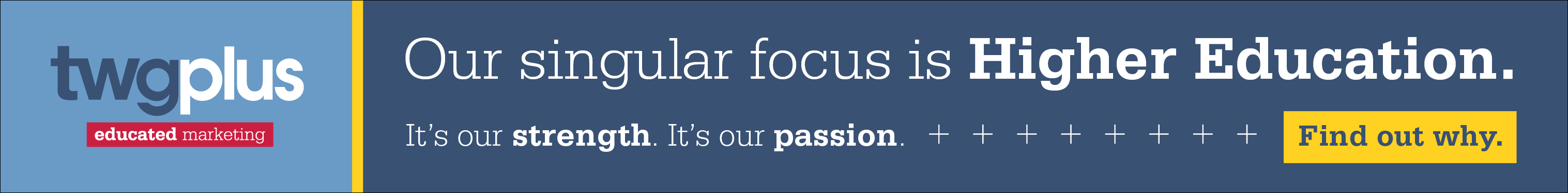
My digital pieces include a medium rectangle and a leaderboard web ad. I wanted to keep these ads simple but include a strong message and call to action. This copy conveys a passion for higher education that appeals directly to future clients. It makes a clear statement about the passion we have for what we do, which piques the reader's interest and drives them to visit our website. As a bonus, I also did a "before & after" makeover of an infographic post I found on the TWG Plus Facebook page. This was a chance for me to share my infographic skills while introducing the new style of icon illustration to the brand.

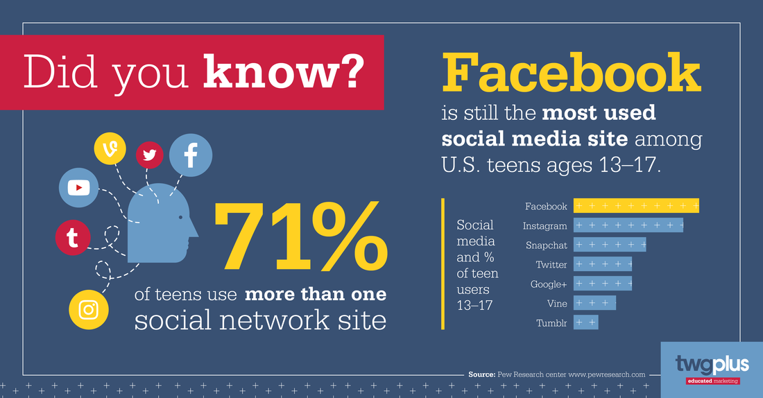
"DID YOU KNOW?" is a before & after piece - check out the original graphic here.
A Final Look
Using bold primary colors paired with thoughtfully placed patterns and styled icons, I created a cohesive group of materials that are friendly, informative and remind one of education.